Fluxx Design System
Worked cross-functionally to establish foundational design infrastructure supporting cohesive user experiences and scalable front-end development.
⏰ Timeline
4 Weeks
👥 Team
1 Engineer + 2 Designers
📌 Role
Product Designer
Overview
Fluxx’s interface had grown inconsistent over time, with fragmented components and interaction patterns creating friction for users and slowing front-end development.
To address this, I led the design of the Fluxx Design System, establishing a unified, scalable foundation for UI components, patterns, and interaction principles across the platform. The system improved product consistency, reduced design and engineering duplication, and simplified front-end implementation, enabling faster and more cohesive user experiences.
building design tokens
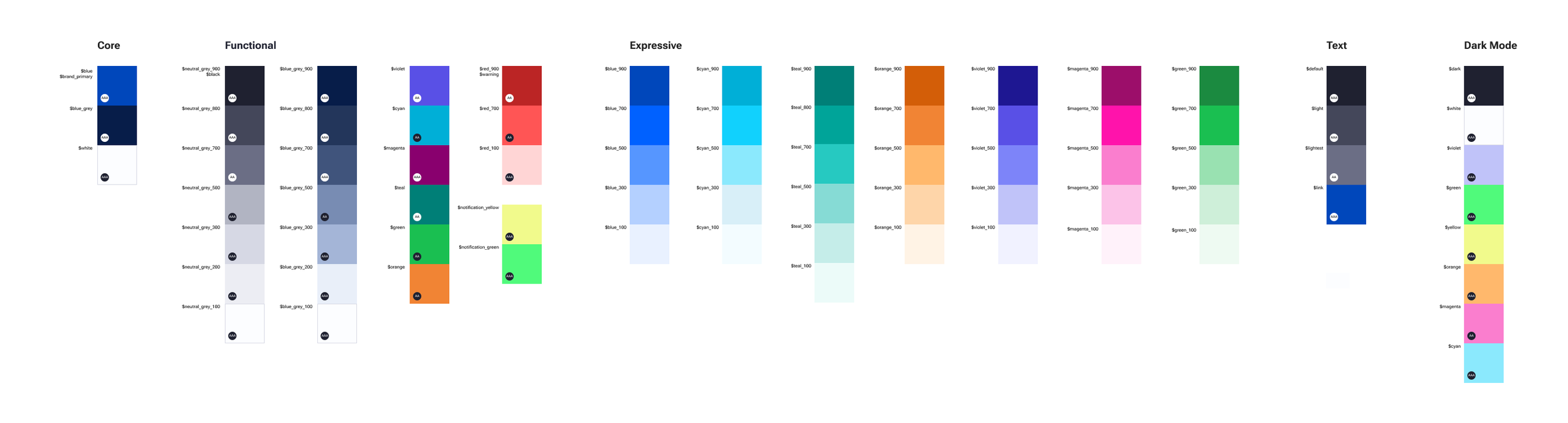
Following the principals of atmoic design I wanted to ensure that our design system color, typography and spacing was highly considered and researched before we began to build initial components. We wanted to ensure the design system once implemented was aligned with Fluxx’s current design architecture, through the following focus areas.
Sets of system colors that were separated into “functional” and “expressive”. Functional being tested for accessibility compliance and used widely across the system. While expressive was a pallete for our marketing team and any decorative elements within the site.
Robust spacing guidelines, first defined by our REM base we were able to build an incremental scale (1-8) that our engineers could easily translate into CSS.
Variable web font, selecting something variable was important for our team. This made it simple for our engineers and provided a ton of uniform options for the UX team
formalizing components
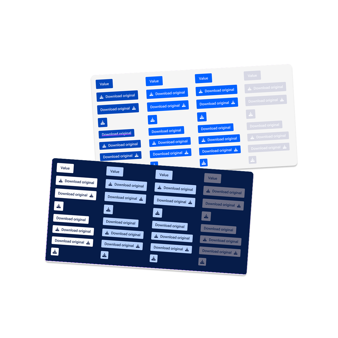
Once the tokens were defined and reviewed, I built, organized, and categorized 100+ individual components and their variants. To capture active, hover, selected, and inactive states across buttons, modals, flags, search bars, text inputs, and alerts, to name a few. These were reviewed and built by our engineers to allow for further testing.

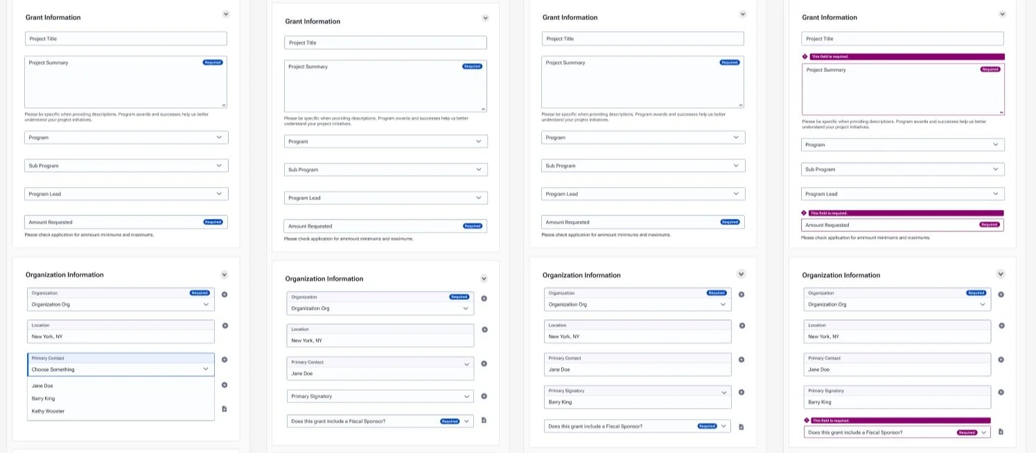
thinking big with design patterns
Focusing on areas that impact our users most, we built mock forms with our components. We started with forms because they are the primary tool used to review grant requests and proposals. It was an essential place to begin for the industry we serve. We then worked with our engineers to build and test a live form moving the process outside Figma and into code.
With the form example built, our next steps are to begin the research phase to review the forms and components in the current system for usability, accessibility, and clarity. Iterating on the system quickly based on the feedback provided.