Demographic Data Visualizations
Leading design to replace fragmented data with seamless API integration and intuitive dashboards.
⏰ Timeline
3 Months
👥 Team
1 PM, 2 Engineers + 1 Designer
📌 Role
Product Designer
Overview
Nonprofit demographic data critical to funding decisions was siloed outside Fluxx, forcing users into manual imports and fragmented workflows.
I led the design of Demographic Data Visualizations, embedding Candid’s data directly into the platform through API-driven integration and intuitive dashboards. The solution reduced workflow friction, improved access to insights, and delivered fully accessible visualizations designed to meet WCAG 2.2 AA standards.
User Experience Gaps
Each year, grantmakers using Fluxx distribute approximately $20B to nonprofits, with demographic and DEI data heavily influencing funding decisions. Despite its importance, this data was difficult to operationalize within core workflows, creating friction at both the user and platform level.
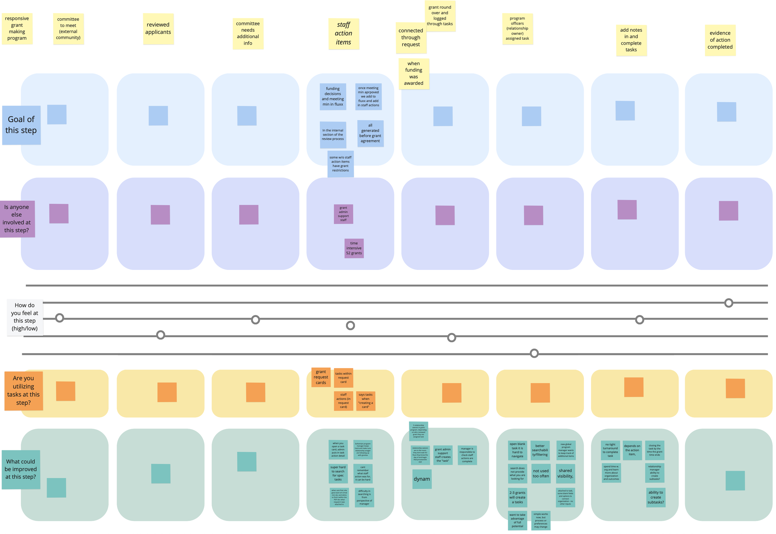
Leading discovery and cross-functional research, I identified several structural barriers preventing users from making efficient, data-informed decisions:
Manual and repetitive workflows
Funders repeatedly requested and re-entered demographic data, creating unnecessary overhead and quickly outdated records.Inconsistent data structures
Submissions varied widely across organizations, limiting reliable comparison and increasing cognitive load.Limited decision support
Non-technical users struggled to interpret raw data, while advanced users lacked integrated analytics and flexible data controls.
At the ecosystem level, Candid had begun standardizing nonprofit data within its own platform. However, Fluxx users were still forced to leave their primary workflow to access those insights — introducing fragmentation, inefficiency, and churn risk.
Outcomes
Recognizing this as a product and workflow failure rather than a reporting gap, I framed a strategic design opportunity:
Embed standardized demographic data directly into Fluxx
Transform visualization from a reporting layer into decision-making infrastructure
Enable insight-driven workflows without platform switching
This reframing positioned demographic data as a core part of the grants management experience rather than a disconnected reference tool.
Mapping the API
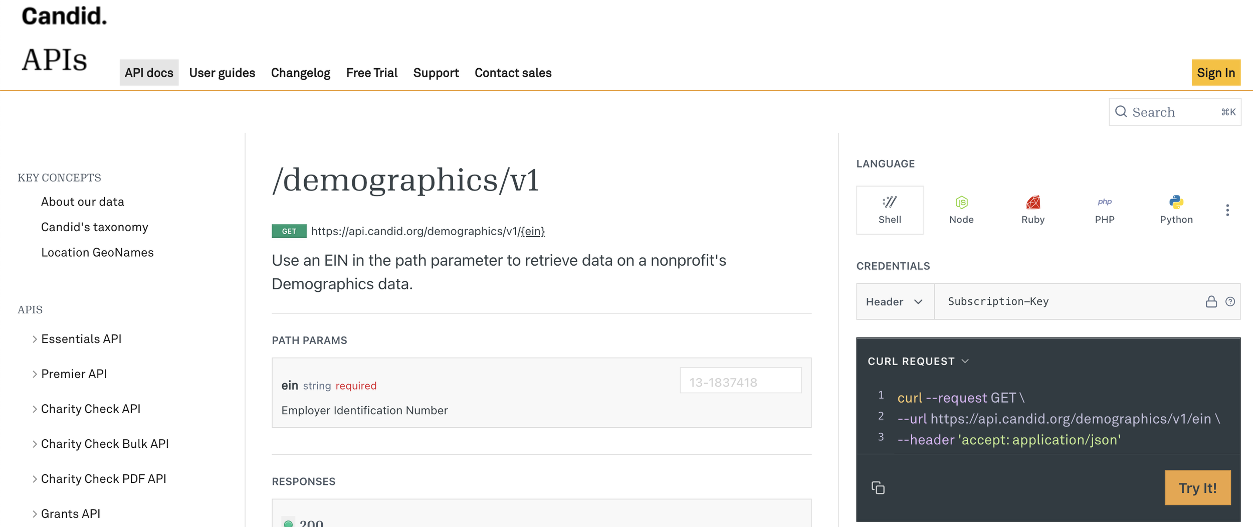
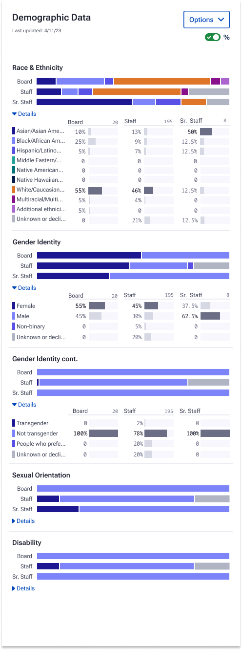
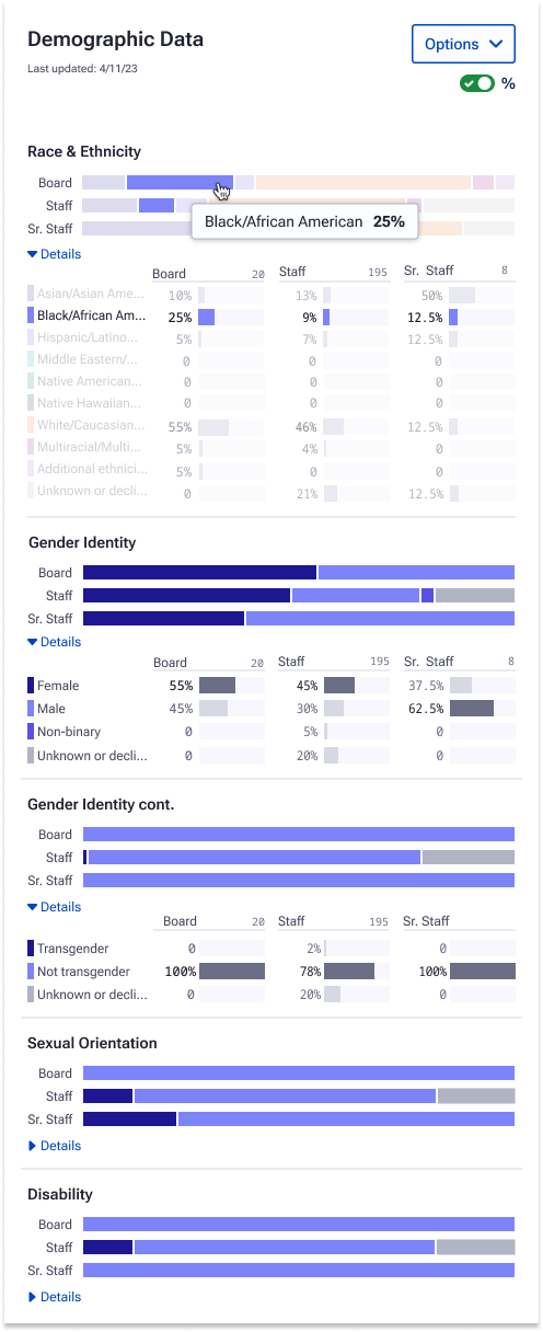
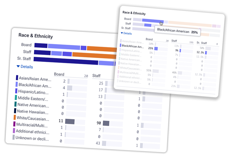
After research, I partnered with engineering to break down Candid’s Demographics API—focusing on what data could be surfaced directly in Fluxx. The API delivered standardized nonprofit demographic data on leadership, staff, and boards, including race/ethnicity, gender identity, sexual orientation, disability status, and data completeness percentages.
Together, we:
Mapped API endpoints to user needs, identifying which demographic fields could power in-app benchmarking and portfolio summaries.
Defined aggregation logic for visualizations, ensuring raw values rolled up accurately into percentages for charts and tables.
Prototyped visualization patterns (stacked bars, comparative breakdowns) aligned with the structure of incoming data.
Validated edge cases early, such as missing or incomplete data, to ensure the UI rendered accurately across all scenarios.
This close design–engineering alignment cut iteration time by ~30% and accelerated prototyping by two weeks, allowing us to deliver a technically sound, insight-driven experience.
Turning Constraints Into Design Opportunities
Navigating Design Constraints
The visualization needed to fit within Fluxx’s record view, tall but narrow, and with limited horizontal space. This shifted the challenge from what to show to how to show it clearly.
Key takeaways:
Spatial limitations: Limited width required a careful visual hierarchy and compact component design.
User needs: Users needed to interpret demographic data quickly, without losing trust in accuracy.
Technical constraints: The Candid Demographics API surfaced standardized but fixed data (e.g., race/ethnicity, gender, orientation, disability, and completeness scores), defining what could be visualized.
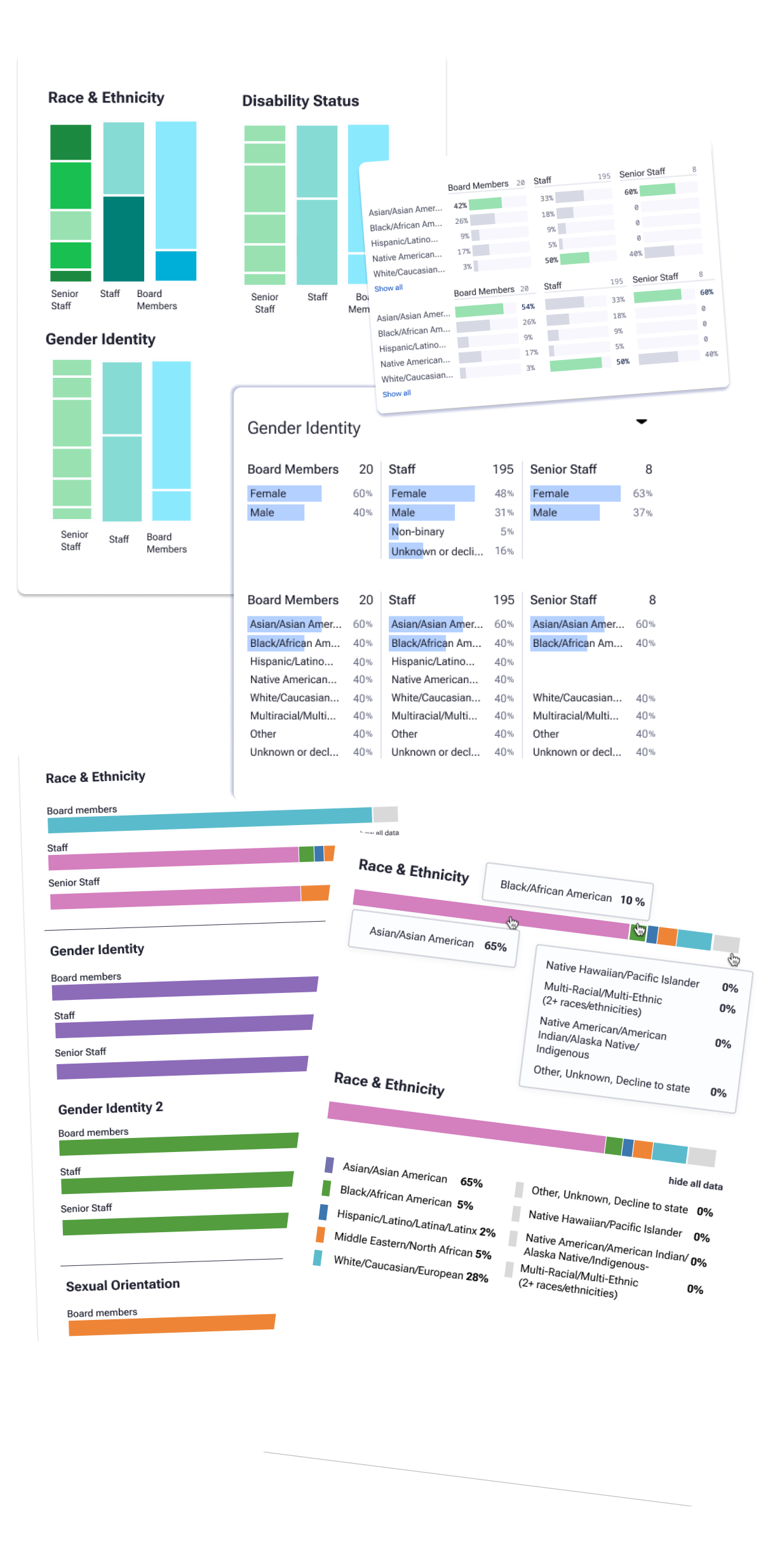
Iterative Exploration
Another designer and I explored multiple visualization styles. From tables to interpretive charts, testing for clarity and usability.
What we learned:
Designed for a wide range of data fluency. From non-technical users seeking simple, easy-to-scan visuals to more technical users needing consistency and depth.
Labels and percentages were essential for trust and data accuracy.
We refined designs, finally landing on a stacked bar-chart visualization optimized for quick scanning and data integrity.
Fast feedback loops with users and engineers kept iterations feasible and focused.
We continued to work towards a final direction to ensure constraints were not blockers and met users where they were in their data literacy.
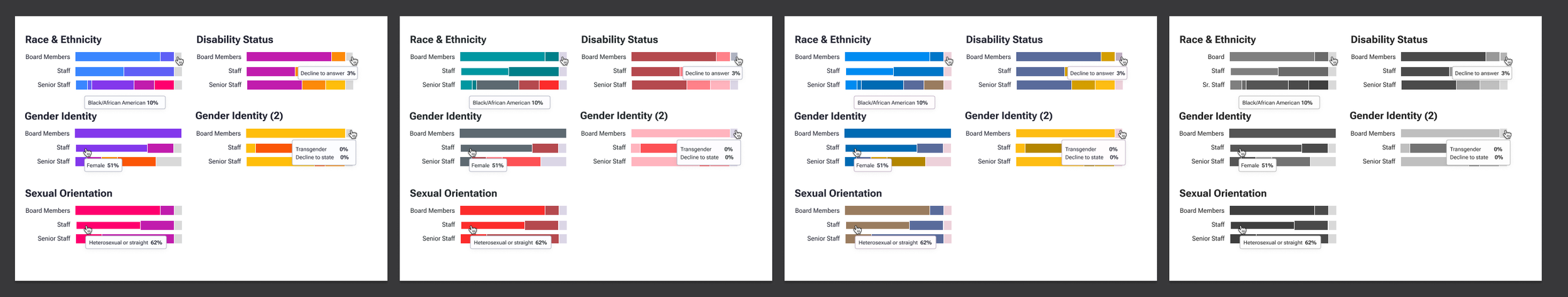
Designing for Accessibility
Accessibility shaped every design decision. Because it’s often missing from data visualization practices, I advocated for the time and focus needed to make these charts fully compliant and inclusive for all users.
My work on defining accessible colorways for data visualizations was especially impactful. By testing palettes across multiple types of color blindness and validating contrast against WCAG guidelines, we ensured that the charts were not only visually clear but also universally interpretable.
This investment paid off: the final visualizations reduced the likelihood of accessibility-related support issues and set a new design standard for accessible data visualization within the Fluxx product.
Final Design + Outcomes
The final designs introduced data visualization into Fluxx for the first time, making complex information both accessible and actionable.
Key outcomes included:
Real impact to the business: Became a core selling point in client demos, helping Fluxx expand into the public sector and directly contributing to an increase in ARR.
Real impact to users: Boosted dashboard engagement by 35%, increased adoption across major clients, and reduced reliance on manual spreadsheets for reporting.
Accessibility that scales: Validated color contrast and tested across multiple forms of color blindness to meet WCAG standards, ensuring usability for all audiences.
Accelerated delivery: Early engineering alignment cut design-to-dev iteration time by 30%, enabling faster release cycles and stronger product velocity.
Future-ready framework: Established design patterns that could scale to future visualization features.
This project demonstrated how aligning technical discovery, thoughtful design, and accessibility can accelerate delivery while raising the bar for user experience across the platform.
Read about this project on Fluxx’s Blog